Responsive Web Design
-
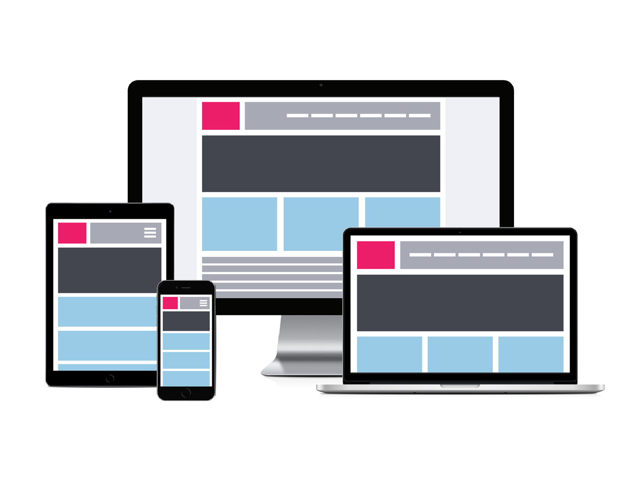
Responsive Web Design (RWD) is based on the size of the viewable area rather than the device you are using. As your visitors switch from laptops to mobile phones, your website should automatically present the content in a way that is easy to consume. RWD ensures compatibility even with devices that do not exist yet. RWD automatically adjusts and doesn't require custom-made solutions for each new device.
Creative Services leverages RWD technology to ensure that the information on your website is presented attractively on every device. Whether your visitors use PCs, tablets or phones, they will have easy access to the information on your website.
Our RWD designs have five views. This helps ensure that your information will be accessible, user friendly and attractive with no pinching and zooming required.
Web Community Manager & Adaptive Content
-
Visitors to your website are using their desktops, laptops, tablets or smartphones to find information. You need your information—your content—to display easily and effectively on any device or screen—with minimal pinching and zooming. You'll optimize that experience by having a responsive template on your website and by creating content that is adaptive.
The results of an Internet search on Adaptive Content include a lot of information about personalization—both for content itself and devices. Here we use Adaptive Content as a way of describing how to"chunk" your content. Within Web Community Manager, that means not just using apps, but using the right apps for the the type of content you want to present.- Use a Content App to present text like this article.
- Use an Image App to display an image like the one shown on this page.
- Use a Table App to present tabular information.
As visitors to your website move from device to device, these "chunks" of content will move around and adapt to the viewable area of the device.Using Apps to Create Engaging Pages provides examples of how to chunk your content.

RWD Views
-
Here are the five views included in our RWD designs.1280 X 768 PC768 + Tablet640 + Phone on side, Tablet480 + Larger iPhone or Android320 + Smaller Phones and devices


